What is the Elder Impulse System?
The Elder Impulse System (Alexander Elder) is a simple trading framework that combines
a 13-period Exponential Moving Average (EMA) to define trend and the MACD Histogram to measure momentum.
When trend + momentum agree, the system highlights “impulse” buy/sell conditions using color-coded bars.
Quick Summary
- Green bar: trend up + momentum up → bullish impulse
- Red bar: trend down + momentum down → bearish impulse
- Blue bar: mixed signals → no impulse / neutral
- Works best when you align your trades with a higher timeframe trend
When you’re starting to trade, it helps to learn structured systems used by professionals.
The Elder Impulse System, designed by Alexander Elder and featured in his book
Come Into My Trading Room
,
is a simple but powerful framework combining trend and momentum.
How the Elder Impulse System Works
The system combines two indicators:
- 13-day EMA: identifies the direction of the trend
- MACD Histogram: measures whether momentum is increasing or decreasing
Signal Rules (Color Bars)
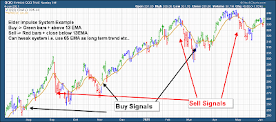
The ease of use comes from the color-coded bars (see the chart at the top). Here are the rules:
-
Green price bar: the 13 EMA is higher than the prior period’s 13 EMA and
the MACD Histogram is higher than the prior period’s MACD Histogram.
Interpretation: bullish impulse (often a “go long” environment). -
Red price bar: the 13 EMA is lower than the prior period’s 13 EMA and
the MACD Histogram is lower than the prior period’s MACD Histogram.
Interpretation: bearish impulse (often a “sell / go short” environment). -
Blue price bar: the conditions for green or red are not met.
Interpretation: neutral / mixed signals (many traders avoid new entries here).
In plain English: green = rising trend + rising momentum, red = falling trend + falling momentum.
Blue means the system is telling you to be selective.
Timeframes (Trade in Harmony With the Bigger Trend)
Elder emphasizes aligning your intermediate timeframe with a higher timeframe trend.
A simple heuristic he suggests is:
Higher timeframe ≈ 5× your trading timeframe
Example: If you trade the 60-minute chart, your higher timeframe is roughly the 4-hour chart.
Example: If you trade the 60-minute chart, your higher timeframe is roughly the 4-hour chart.
This helps you avoid fighting the dominant market direction.
When to Enter & Exit the Market
Use the system as a filter:
- Buy bias: higher timeframe trend is up and the Elder Impulse bar is green.
- Sell / short bias: higher timeframe trend is down and the Elder Impulse bar is red.
- Ignore: when the higher timeframe trend is unclear or bars are mostly blue (mixed conditions).
Example: If your intermediate timeframe is daily, check the weekly chart first. If weekly is in a clear uptrend,
you prefer acting on bullish (green) impulses on the daily chart.
Conclusion
Elder designed this system to encourage a professional approach: enter carefully and exit quickly when conditions change.
It’s meant to keep you out of low-quality, choppy trades where trend and momentum disagree.
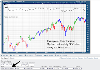
I encourage readers to use a website like StockCharts to paper trade and test
the Elder Impulse System. It’s a strong starter system that can be refined through practice and backtesting.
Below is an example showing how to use StockCharts with the Elder Impulse System:
I hope this guide helps anyone who wants to start using an actual trading system. Check out my other articles on indicators like
ADX and
RSI.
And if you want a deeper system-based approach, check out:
Using Ichimoku Clouds for Daytrading.


